Monday, 5 December 2011
Evaluation
http://www.youtube.com/watch?v=57GdTKVFjkw&feature=plcp&context=C3e3621eUDOEgsToPDskJMB_2Q8hhKd7nDoDW0XEil
Tuesday, 22 November 2011
Audience Feedback
1. Do you think the magazine appeals to the relevant audience?
2. Were you able to tell what the target group for our film was?
3. Are there are improvements that could be made to the film?
4. Would you recommend this short film to anyone else if it was ever released in cinemas?
5. Would you be able to relate to the issues raised in this film?
6. Does the film flow appropriately or does it look unrealistic?
7. What improvements should be made to the poster and why?
Anna, Olivia and Abigail
These girls felt that the magazine appealed to the audience because of the font style and the colours on the magazine as well and this made it easy for them to work out which target audience the magazine was aimed for. One improvement they suggested to the film would be to change the font for '2 months later' and try to relate it more to the magazine to show the depth and seriousness of the magazine and film. If these recommendations are followed through then they said that they would recommend the film to other people. All three of them said that they cannot personally relate to the film but they can empathise with the characters' situations and are aware of the storyline within the film. They said that they like the flow of the film and it looks realistic and it has a good storyline to go with it and they believe that the poster does also compliment the magazine and the film and no changes should be made.
Nisha, Sharonjit and Neelam
They believed that the magazine did appeal to its target audience of youths and one way they were able to tell who the target group was through the way that the actors were dressed in the magazine article. This group did not think that any changes should have been made to magazine article and by watching the contents of the film, they said that they would recommend our film to people if it was ever released in cinemas. These girls stated, however, they would not be able to relate to the issues raised in the film and could probably be because this genre of film does not include them in it. The film flowed well along that stated that they felt like they knew about what scene would be next and the intensity of that scene. When it came to the poster they said that we should leave it the way it is.
Nayib, Gurdeep and Isaac
These boys said that the magazine is relevant to the film because the setting and the lighting of the magazine links to the film which implies intensity, misery and intensity. They said that through this they were able to tell what genre the film was because of the typical stereotypes associated with the characters and the contents of the film. The sound in the film is something that could be improved as they said that is should be faded in rather than coming in unexpectedly. They would also recommend the film to people if it was ever released in cinemas because they themselves have sort of been able to relate to the contents of the film. Regardless of the minor changes they suggested they do think that the film flows appropriately and another change they suggested was to the poster and they feel that the change should be the font on the title of the poster.
Manisha, Carendeep and Aynsley
They thought that the magazine appealed to its relevant target audience and they were able to tell what the target group for all of the products are. They didn't think that any changes should be made to the film and it would be a film that they would be able to recommend to others if it was released in cinemas. They also felt that they wouldn't be able to personally relate to the issues raised in the film but that others could. They felt that the flow of the film was appropriate and was realistic and was something that relates to current issues in today's society. They also felt that no changes needed to be made to the poster.
Sonia, Qasim and Komal
They also believed that the magazine appealed to its relevant target audience and they were also able to identify the specific target group for the magazine review and the film. They felt that there were no changes that needed to be made to the film and it is something that they would recommend to the right people if it was released in cinemas. They couldn't personally relate to the contents of the film but they could see how others would be able to do so. They felt that the way the film was edited flowed really well and that when it came to the poster there was no changes that needed to be made.
All groups felt that our magazine related to the film and no changes needed to be made to it. A couple of changes were recommended for the poster and the film and if these changes are possible then they will be made and if it improves the current state of the work then these recommendations will be kept.
Song Choices for the Film
These are the different songs that we would like to incorporate into our short film. The different lyrics in these songs all do serve some signifance to the contents of the film. We will fit all of these different songs in according to whatever scene they suit the most. Another reason that we chose these songs is because they are songs that we related to and thought they would also help to explain the contents of the film alongside the storyline.
Skepta - Hold On
Chase & Status ft. Tinie Tempah - (HITZ)
Dappy - Tarzan Freestyle
Maverick Sabre – Let Me Go
Professor Green ft Maverick Sabre - Jungle
Tinie Tempah – Obsession
Tinie Tempah and Emeli Sande
Skepta - Hold On
Chase & Status ft. Tinie Tempah - (HITZ)
Dappy - Tarzan Freestyle
Maverick Sabre – Let Me Go
Professor Green ft Maverick Sabre - Jungle
Tinie Tempah – Obsession
Tinie Tempah and Emeli Sande
I.O.U Film Script
I.O.U.
Int. George Park Scene - Night
Lewis and Marcus are arguing in the middle of the park.
Marcus throws Lewis up against the basketball cage.
Marcus
You don’t have to do this man, your going to end up getting yourself killed!
Lewis
Hey! You’re meant to have my back with anything Marcus; I’d do anything for you!
Marcus
Well don’t do this for me then!
Lewis
It’s too late for that… Now are you coming or not?
Cut To:
Int. Marcus’s home - Day
A close up shot of Marcus picking up the mail, finds a letter with his name on. Extreme close up of him opening his letter showing his eyes looking at the letter.
Marcus
I got in, I did it. (Shouts) I GOT IN!
Cut To:
Int. Black screen –
Shows the film title
‘‘I.O.U.’’ Soundtrack starts Soundtrack playing – Chase & Status ft. Tinie Tempah (HITZ)
Cut to:
Int. Marcus leaving his home and on his way to college - Day
Soundtrack playing – Chase & Status ft. Tinie Tempah (HITZ)
Quick shots of Marcus walking to the bus stop, getting on the bus and walking into school. The camera will be showing the environment in which Marcus lives, establishing his class and lifestyle. The intro ends with Marcus walking in to his school gates being shown through a long shot
Music fades out
Cut To:
Int. Outside the school gates - Day
Long shot showing Lewis looking a bit mysterious, then he is shown with a close up, to make his identity clear and established as a main character, then in the background of Lewis’s close up Marcus is shown walking up and out of the school. They both notice each other and start talking, Mid-shot
Marcus
Yo! Lew! What’s goin on bro? How come you’re here?
Lewis
Hey man, I just thought id pay you a lil visit; see how my boy is doin. Still at this dump I see, aha!
Marcus
Ah Yeah, dropping out wasn’t an option for me.
Lewis
Yeah well it was the only option for me.
Marcus
Well me staying here has finally paid off! I’m going to America to play Lou! All I have to do is get through the rest of the year! This scholarship is it man! I got the letter this morning
Lewis
That’s great man, I’m happy for you… if I didn’t go you know that would be me right? Aha!
Marcus
Aha! Yeah sure!
But I did come to ask you for something
Marcus
Sure man, what is it?
Lewis
I need you to come on a job with me tonight, 11 meet me at Cage Park.
Marcus
Lou, you know I aint into that stuff…
Lewis
You know I wouldn’t ask unless I had no other choice. You’re the only guy I trust, com’on man
Marcus
Ahhh Okay man, I got you, Cage Park at 10 yeah?
Lewis
Naa 11! I’ll catch you later yeah
Marcus
Cool!
Cut To:
Int. Streets - Day
Soundtrack starts ‘’Dappy-Tarzan Freestyle ‘’
Lewis walking down the road (Fades out) then close up of Marcus’s face. Then Marcus walking in the other direction. Following Marcus’s walking journey to his girlfriends house, showing the distance from his college to hers (Close)
Cut To:
Int. Rebecca’s house- Day
Music fades out as he walks up to knock the door and completely stops when he is let in. They hug and then go and chill out on the couch in the living room.
Rebecca
Hey, what’s going on?
Marcus
Lewis came to my college today and asked for a favor, he needs me to go with him on a deal tonight… I don’t know what to do.
Rebecca
if it’s going to be dangerous then there’s no way you can go! You have too much to lose! Lewis doesn’t! That’s why he does this stuff
Marcus
I know but he’s like a brother to me.
Rebecca
Its your choice Marcus, just please be careful
(Text message from Lewis saying the deal is now at 10pm, not 11)
Marcus
Oh what! Ah, I’ve gotta go Rebecca; I have to meet him earlier. I’ll text you later okay
Rebecca
But you only just got here!
Marcus
I know but I’ve gotta get home before later… I’ll text you tonight, okay.
Soundtrack starts ‘’Maverick Sabre – Let me go’’ Marcus leaves. Rebecca standing at the door watching him walk away)
Cut To:
Int. Streets - Late day
Walking home, (Marcus) lots of extreme close ups showing his facial expressions ‘’Frustrated’’. Kicking the bus stop showing his emotion. Arrives home, throws bag and BALL down, gets in the shower, eats some food (close ups and mid-range shots) puts coat on, walks past his basketball and bag (Use the same shot when putting them down to show he is leaving his ball)
Cut To:
Int. – going to the park – Night
Soundtrack starts ‘‘Professor Green ft Maverick Sabre - Jungle‘’
Series of cuts in action showing his journey to Cage Park. Close up/long range/tracking/pan shots
Cut To:
Int. Cage Park - Night
Close up shot of Lewis, talking to another gang member briefly about the job tonight, in the background we see Marcus walk up behind Lewis. Close up of Marcus saying:
Marcus
Hey man, can I talk to you real quick?
Lewis
Yeah sure, quick though, we have to leave in a minute, for a second I thought you weren’t going to make it! (Laughs)
Marcus
Lou, I’m not going with you man… I can’t let anything jeopardize my chances of going to America.
Lewis
(Turns to other gang member) blood, take this and go wait in the car. (Turns back to Marcus) Marcus, stop being stupid, lets go; I can’t have you being like this now.
Marcus
No, I’m done with this, its not right, you don’t have to do this either! You can do anything you want too! You can go back to…
Lewis
Don’t preach to me man! I aint like you! I can’t do what you do…. Now just do me this one last favor before you leave everything here behind forever and come with me! You owe me, remember?
Marcus
No, forget this, I’m going…
Lewis
(Grabs Marcus) – No you aint (shouts)
(Back to the beginning)
Lewis and Marcus are arguing in the middle of the park.
Marcus throws Lewis up against the basketball cage.
Marcus
You don’t have to do this man, your going to end up getting yourself killed!
Lewis
Hey! You’re meant to have my back with anything Marcus; I’d do anything for you!
Marcus
Well don’t do this for me then!
Lewis
It’s too late for that… Now are you coming or not?
Marcus
‘Pause’… no, bye Lou
Soundtrack starts ‘’Hold on - Skepta‘’
Shot to reverse shot of Marcus walking away and Lewis’s face, then an establishing shot of them two walking away in two different directions. Cuts to black ‘‘Music starts to play’’ ‘’ Dare to dream/Hold on*****’’ Music fades
Int. Marcus’s home - Day
Marcus goes home and the next day while Marcus is packing his suitcase he gets a phone call from Lewis (Extreme close-up showing ‘Lewis’s’ name and picture on the phone screen, shot and reverse shots showing Marcus trying to make up his mind if he should answer or not. Cuts black, then Marcus saying ‘Hello?’
Soundtrack starts ‘’Hold on - Skepta‘’
END
Magazine Review Build Up


Poster Build Up


Poster Mock Up


As Adulthood is the main inspiration for our movie we are looking to make our poster look similar to that but it will obviously have our own twist on there with the images we took. When it comes to the images on our poster, we would hopefully like to take them mid-afternoon going towards the evening to make the audience see how we are trying to put in this element of mischief and trouble with it. The poster really needs to help play on the idea of dreams and obstacles that the individual will face both personally and morally and if there are any solutions to overcome these obstacles.
Wednesday, 12 October 2011
Magazine Mock Up


Monday, 10 October 2011
Filming Schedule
Filming: 24th - 30th October 2011 (Filming will be done during this entire week).
Photographs: 24th - 30th October 2011 (During this entire week photos will be taken in the appropriate locations).
Editing: Week beginning the 31st October 2011 - 25th November 2011
Magazine Review and Poster: 17th November 2011 - 9th December 2011
Photographs: 24th - 30th October 2011 (During this entire week photos will be taken in the appropriate locations).
Editing: Week beginning the 31st October 2011 - 25th November 2011
Magazine Review and Poster: 17th November 2011 - 9th December 2011
Job Allocations
Casting (Jordan and Marie): Both of us worked on casting our characters because we had a good idea of who we wanted to play the characters. Sam, Jason and Hezzron are the three people that we have chosen to play these characters and we know that they are people we will be able to work with as they have the capabilities of play these characters properly.
Directing and Filming (Jordan and Marie):Jordan will be filming the short movie whilst I will be doing the directing. We will both be able look at the scripts and include any necessary changes if it comes to it and will make sure that we follow the script outline as much as we can.
Editing (Jordan): Jordan will do the majority of the editing but I will help him to do it as well. He will physically do the editing and I will just input my ideas where it is necessary. By doing this we are likely to get out work done more accurately and quicker this way.
Scripting and Soundtrack (Jordan): Jordan will complete the script for the movie and I will still be on hand if he needs any help with it. Jordan has also researched some songs that we are likely to incorporate into our movie at different points and he has included the points where the songs will come in on the script.
Analysis of Work (Marie): Whilst Jordan completes the scripts I will work on the analysis of films, magazine reviews, poster reviews and any other forms of analysis with the work. I will also try to make sure that the blogs are up to date as much as possible and make sure that Jordan also has a copy of the work.
Magazine Review (Marie): I will be working on the magazine review page. We will both take images for the magazine but I will be the one that constructs the double page spread by inputting the text as well and ordering the page accordingly.
Poster (Marie): I will also put together the poster from the photographs that we are going to take. I will work on constructing the poster by looking at the film posters we did reviews on and use them as our inspiration when it comes to the setting, colours and any props that might be necessary in the poster.
Sunday, 9 October 2011
Planning: I.O.U
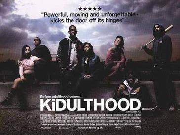
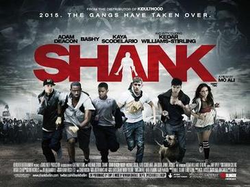
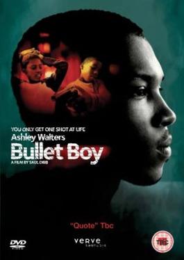
This film is going to be about a young teenage boy who is extremely talented at basketball and has been offered a scholarship to play basketball over in America. All is well until his friend gets himself into a situation that he feels he is obliged to help him through even though he does not want to pass up the opportunity of going to play in America. We have linked our film to Shank, Bullet Boy, Kidulthood, Save the last Dance and 4.3.2.1. All five of these films link specifically to our film in different ways and the content for each film enables us to work on a film that we feel showcasing the topic of Urban Youth that we decided on.
The reason that we chose urban youth is because as young individuals ourselves, we felt that this topic would showcase what we can do and how we can relate our ideas of real-life concepts to a fictional film. The different locations that we decided we wanted to film are: the school, in a kitchen and bedroom at a house, in a park, on the bus and possibly through City Centre. These different locations all serve relevance to the different scenes and subjects in our film.
What is the name of the film? What does the name of the film suggest about the film?
We decided to name our film I.O.U (I owe you) and the reason for this is because Lewis (the best friend) in the film feels that Marcus (the main character) owes it to him as a friend to help him out because he owes someone else as well. We decided this would be the perfect play on words because it shows how Lewis is trying to take advantage of his friendship with Marcus because he knows that Marcus is loyal to him and helps him through everything but this time around Marcus is conflicted with his loyalty to Lewis and following his dream - something Lewis is trying to dissuade him from. The title of the film also seems to suit the film because it gives the indication how these two friends face conflict both personally and morally so the I.O.U gives this idea to the audience.
What pace of editing is used? Does the pace increase/decrease at any time?
During editing we are likely to decrease the dramatic scenes to add more effect to the scene and make it more realistic to the theme of our movie. It also adds to the effect that these friends face conflict with each other so the pace shows the intensity and the seriousness of the situation.
We chose to have Sam (Rebecca - the girlfriend), Hezzron (Lewis - the best friend) and Jason (Marcus - the main character) as the main characters in our film because we felt that they were people who would suit the personas these characters would portray. Another reason that we chose them is because they are also people that we know so we knew that they would be able to do the work to the best of their abilities. With our filming schedule we need to work around it because I am always busy at the weekend and Jordan is always busy during the week so we need to make sure that we can work around this as well as Sam, Hezzron and Jason's schedules. We also have Shaqeel playing as accomplice of Hezzron's character Lewis and he is shown at the park scene where the confrontation between Marcus and Lewis takes place.
We have chosen the following settings to shoot some of the scenes:
George Park
House - Hallway, Bedroom
College
Bus
City Centre
The Streets
All of these different locations are relevant to all of the scenes in our short film and we feel that they will all showcase the topic of urban youth that we are showing through the characters in our film.
Wednesday, 5 October 2011
Magazine Film Reviews: Empire - Avatar, The Day After Tomorrow & Kidulthood


The main image on the magazine double page spread does cover both pages and then the beginning of the article starts in the bottom left corner of the page. By making the image spread across both pages, they are showing its significance as well as making the audience think about what scene of the film this is and why they decided to make this image central. We intend to do the same with our magazine and we just have to make sure that it is descriptive and makes the audience see more into the film than they should.

What ideas can be used in the magazine double page review on I.O.U? What will be included on the magazine spread about I.O.U?
With the double page review on our film, we have to ensure we mention the characters, their roles and the content of the whole film. The image we put there should be of a scene in the film which definitely enables the audience to be able to read into what the film has to offer to them. In our double page spread on I.O.U we intend to outline the details of the film, the actors/actresses in the movie and the ideas and perceptions that the movie portrays. It is important that we include the correct information we should also make sure that the image we choose is suitable for the magazine because we want the readers to look into the film and see it for more than what it is and gather an understanding of what we have created.
Ancillary Task - Movie Poster (Adulthood and Shank)

When you first look at this poster all you see is a group of individuals that all look like they have been or are up to no good but if you look beyond all of that there is the likelihood that you can gain a different perspective of it. This poster should make the audience think why the characters are showing this persona and what has influenced the choices they make in the film. This film is a follow up from Kidulthood so if people have seen this film before then they are more likely have a better understanding of this poster as they will know what relations the characters have with each other as well as what to expect in the film.

What ideas of both movie posters are relevant to I.O.U?
The target audience for both of these films would be teenagers. This is even more relevant to our film because we have the same target audience and we are trying to use the ideas that these movies showcase in our film. The concept of friendships, loyalty as well as the personas that are portrayed from these two movie posters are relevant to I.O.U because they give the film its purpose and identity.
Wednesday, 21 September 2011
Moving Image Media - Analysis of 2 Films

Slow motion is used at the point when Sam attacks Trife with the baseball bat. This adds more effect to the storyline because the audience already knows what is about to happen but they want to see if they can be proved wrong. This links in with our film because even though we are not feature specific violent scenes like this, we want to give our audience an insight of what they would expect from these particular characters. This entire scene is relevant to our film because our film does have some aspects of violence in the film and it indicates how violence is a factor that affects urban youth a lot these days and how Kidulthood and our film portrays this. This scene that we chose to analyse is set at someone’s house where a party is being held. This adds more effect to the scene because it makes people wonder what the immediate impact will be after this violent scene and who is going to survive after this.
During this scene, Sam is shown to be wearing a hooded top, jeans and trainers whilst armed with a baseball bat. He is showcasing the negative connotations of his character through his demeanour, attitude and style of clothing because people going to parties would not wear hooded clothing or be carrying a baseball bat. This is relevant to our film because the friend in our film is a very violent person and wants to involve the main character in his problems and he, too, is wearing similar clothing to Sam throughout the film. Looking beyond Sam's clothing the audience might be able to see a frightened individual who sees that the power of revenge is his only survival technique and this is what his clothing represents instead.

Save the Last Dance is the other film that we chose and the scene that we chose in the film is that of Derek and his friend Malakai discussing what they are going to be doing. Malakai, like the friend in our film, is someone who has got himself into things that he shouldn't have and now he has a hard task to face and needs Derek's help. Derek knows that if he goes on to help Malakai then he knows it can ruin his chances of going to medical school but then he is also conflicted about being disloyal to his best friend. All of this fits in with our film because of the idea that our main character wants to follow his dream but try and be loyal to his friend knowing the consequences of it if he does and even doesn't help his friend.
In our film, the main character does actually decide to do the right thing, even though we won't be showing this part, and so did Derek which shows them that they know that they need to follow their dreams and lead a positive and safe life. It also shows the dynamics between them and their friend and that the main characters are still willing to stick by their friends even though they know that their friends will lead them down a dark path.
Kidulthood Link - http://www.youtube.com/watch?v=iUrxrTrinUI&feature=related
Save the Last Dance Link - Unavailable on Youtube
Monday, 12 September 2011
Film Inspirations


The target audience for all five of these films have the same target audience which is teenagers. All of these films have young people in them and this helps them to shoe these audiences how they are trying to relate to stories that generally affect them by using people of a similar age group. They are trying to show their target audience about decisions that affect young people's lives and whether or not they are able to recover from them or have to suffer severe consequences for their actions.
Subscribe to:
Comments (Atom)